Being “mobile friendly” is increasingly important.
You hear it all the time. “You need an app!” “You need this to work on iPhones and iPads and tablets and androids and … and ….”.
The path I’ve taken you down so far with my examples has been very intentional, and has at least one very interesting side effect: it’s very likely you need to nothing more for mobile. You’re already there.
Let’s see why that is, and bust a few myths along the way.
Why mobile matters
For ease of our discussion, I’m lumping both phones and tablets into the “mobile”category. Depending on who you ask, they could be treated as separate items. (As in the pie charts below.)
Put bluntly, mobile traffic is exploding – even for scenarios that might not be considered mobile.
For example, consider Ask Leo! While I cover a broad range of topics, for a variety of reasons the majority of the information on the site is about Windows and Windows software. In other words, traditional desktop (and laptop) usage.
And yet for the first quarter of 2016, nearly one third of all Ask Leo! traffic came from mobile devices.

Even traffic to Ask Leo! On Business, by its nature probably appealing to the more desktop-oriented business crowd, comes in at just over 20% mobile.

The percentage of people who are completely abandoning their desktop computers is slowly increasing as well. The only internet-connected device they own is a mobile device of some sort.
All of these numbers are only going to get bigger over time.
If you want to be relevant to someone using a mobile device, your online presence needs to be mobile-friendly, or you’ll be left behind.
(One more reason to be mobile-friendly? Google has indicated it’s one of its ranking factors. A good mobile experience counts in your favor.)
Why you don’t need an app
Having an “app” (honestly, it’s just short for “application” – in other words, a computer program) for mobile devices is absolutely not a requirement.
You may hear otherwise from some corners, but those voices often belong to someone who’d love to charge you to do the work. Apps aren’t cheap, since to be maximally effective, you’re writing what boils down to a computer program for both Apple and Android mobile platforms.
Apps absolutely have their place. For many online services, business, and products, an app can be a significant asset. But chances are you just don’t need one, at least not at this stage in the game.
As I’ve been saying all along, you need a website. And your website, if designed correctly, will work just fine.
Remember, people don’t search the app store when they need something – they use Google. And what does Google list?
Websites.
What “responsive” means
You want your website to work as well on a mobile device as on a desktop. The current buzzword for one technique that makes that happen is called “responsive” design. All that means is the website can change its appearance based on how wide the screen is. In other words, it’s “responsive” to the various devices it could be displayed on, and responds accordingly.
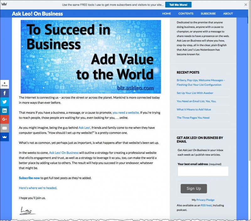
And often responsive is quite literal. Go visit the Ask Leo! On Business home page.

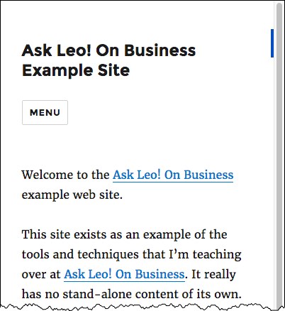
Now, while on that page, grab one of the edges of your browser window and start making the window narrower. You’ll see the elements on the page change, resize and/or reposition themselves in response to your action. At its narrowest, it’ll be a very vertically-oriented layout.

If you visit the site on your mobile device, it’ll look very similar.

That’s a responsive site.
So, that’s my site; what about yours?
Well, if you’ve been following along with our examples, you have WordPress running with the default 2016 theme. Themes are where layout magic happens in WordPress, and the 2016 theme is responsive.

Picking a responsive design means your website is mobile-friendly.
We haven’t touched much on design at this point, but if you find yourself looking at WordPress themes, I strongly recommend you make sure your choices are “responsive” – not all are.
When you might want to address mobile specifically
There are generally two other approaches to mobile: a mobile-specific version of your website, and as we already discussed, an app.
You might want to consider a mobile-specific version of your website if you know that you need to provide a significantly different experience or content when your site is viewed on a mobile device as compared to a traditional computer.
Perhaps you need to display completely different pages, or tailor much of the wording, or … well, to be honest, I don’t know. I’m having a hard time coming up with examples. That’s one of the reasons I much prefer responsive design as a way to handle both mobile and desktop with a single website.
Bottom line: visit your website using your phone or tablet. If you don’t like what you see, chances are your visitors (and perhaps Google) won’t either.
It’s time to get mobile.
Podcast: Download (Duration: 5:24 — 2.5MB)
